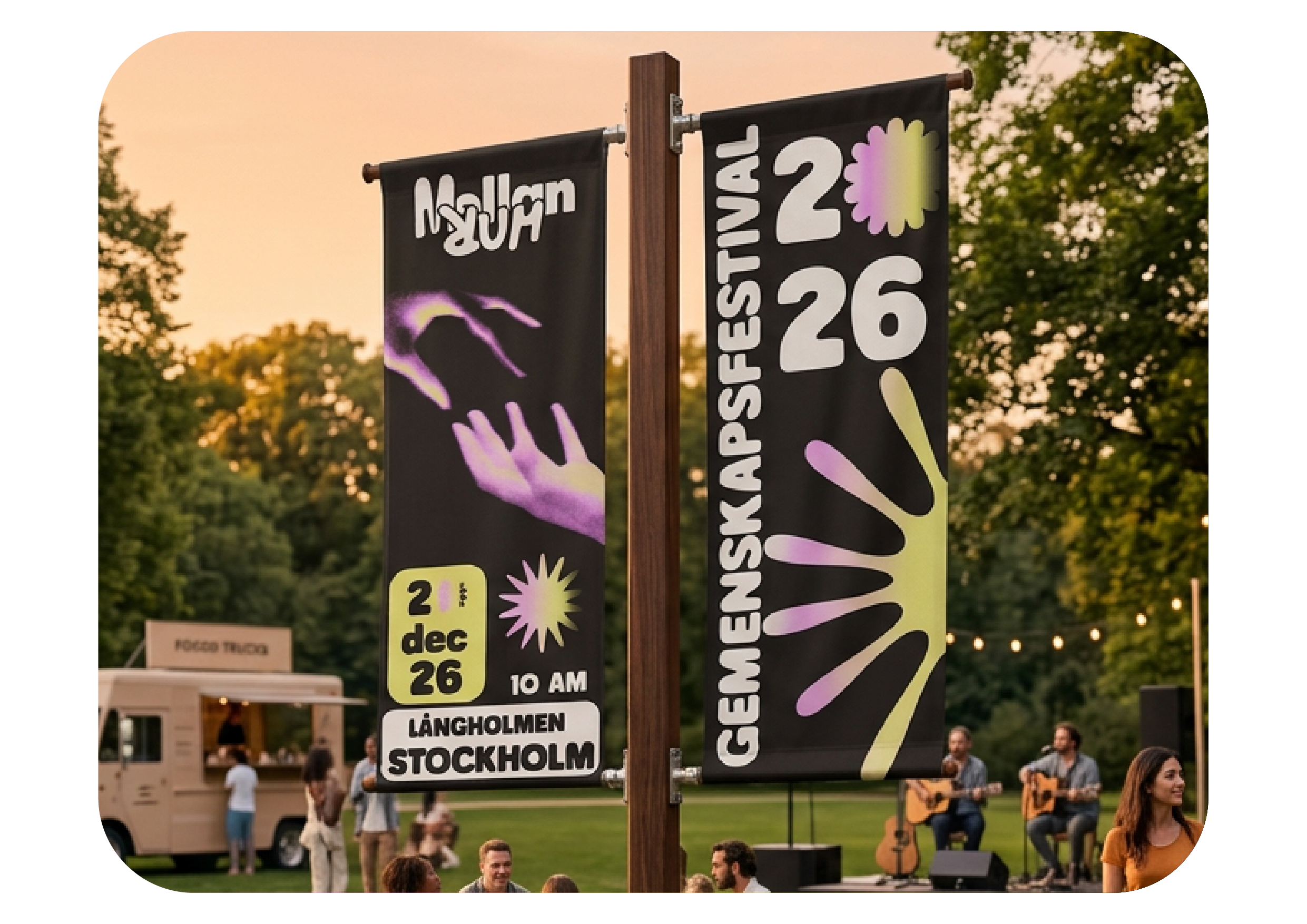

Mellanrum - brand identity for a community festival
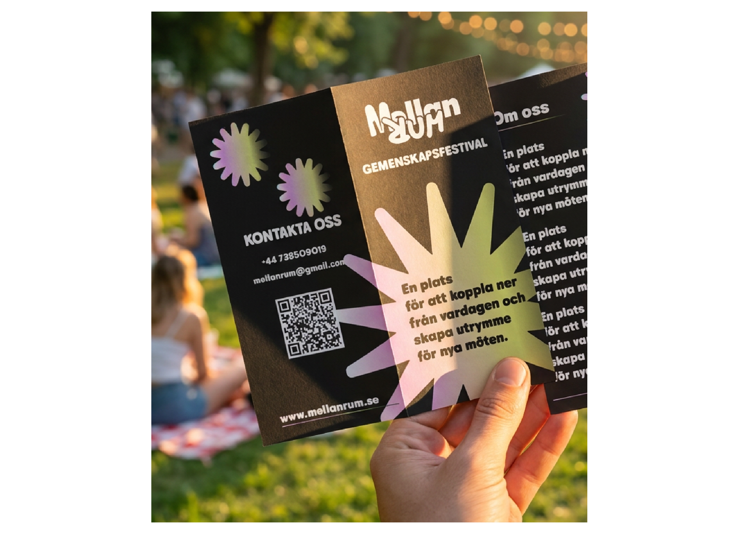
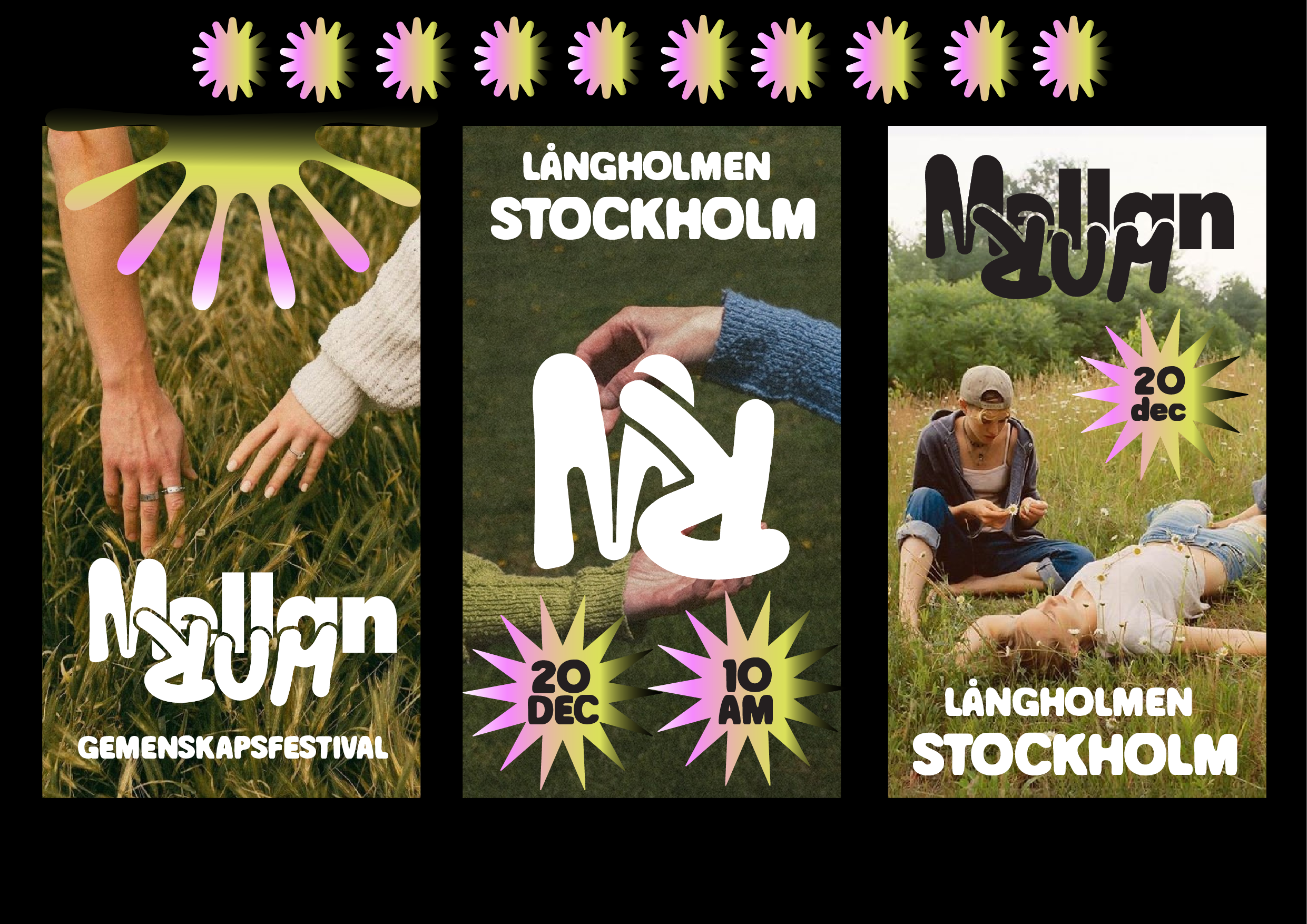
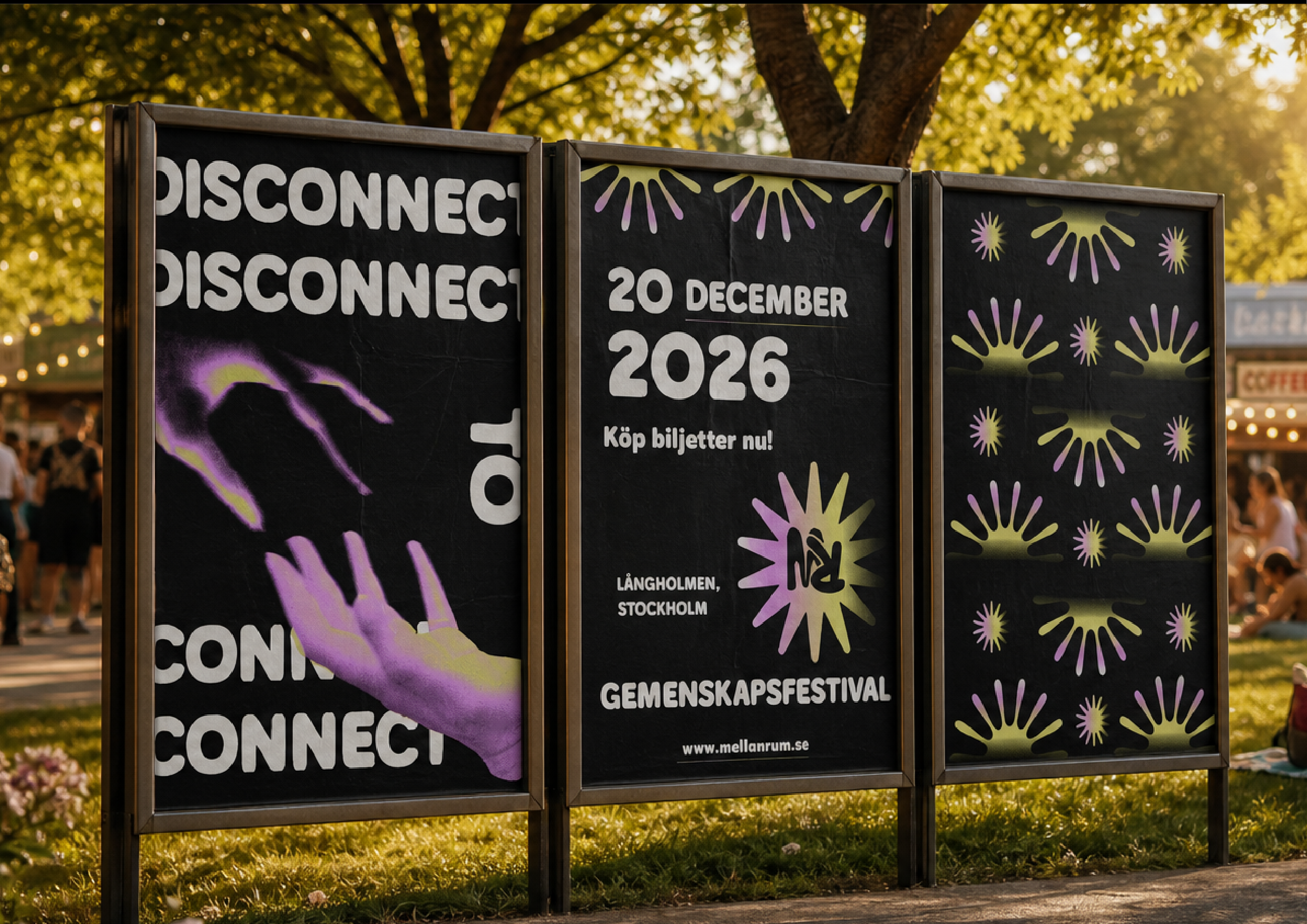
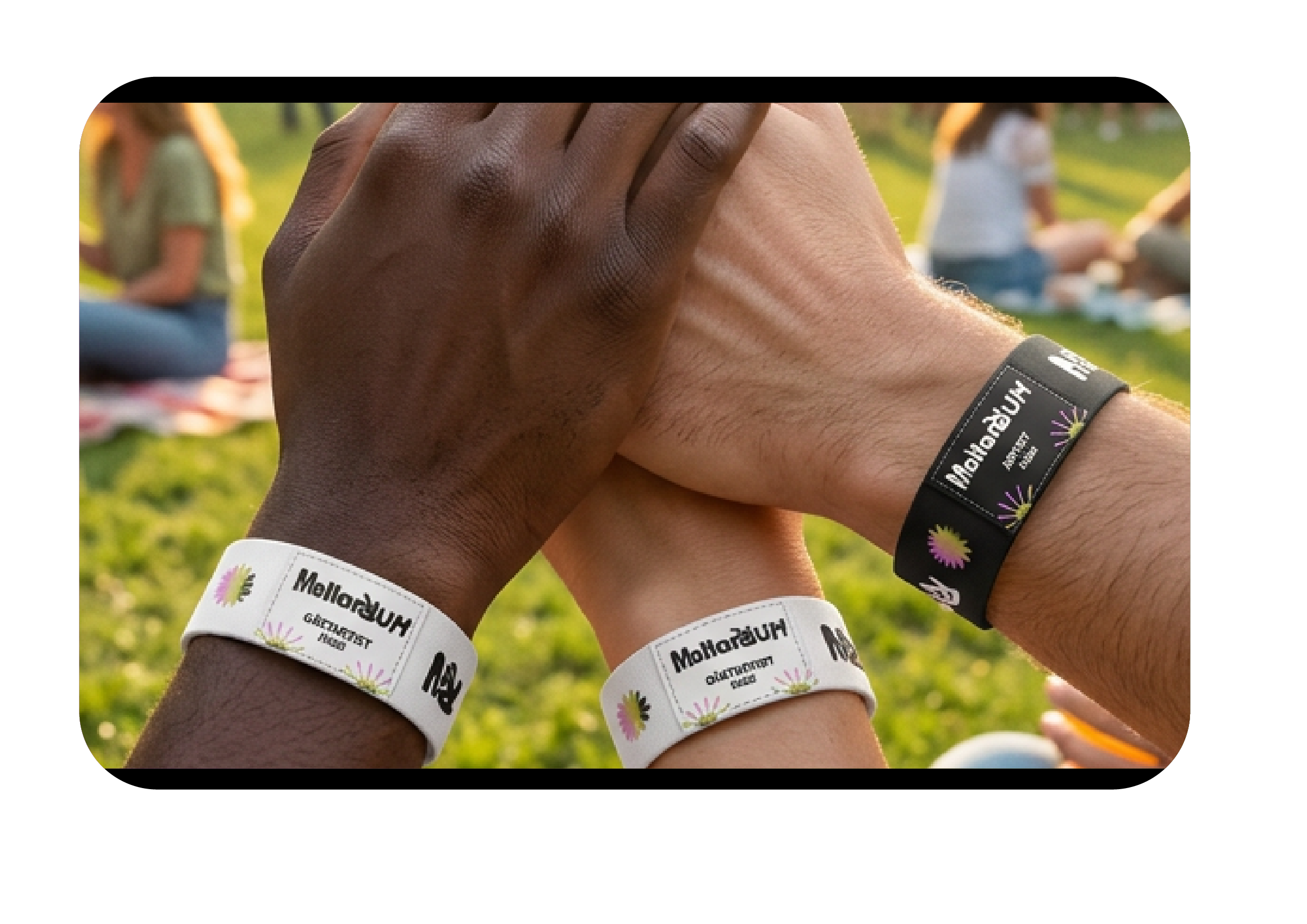
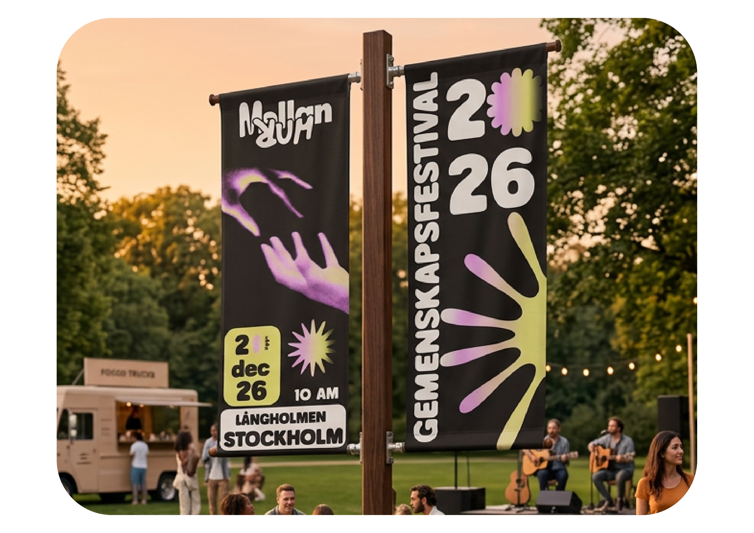
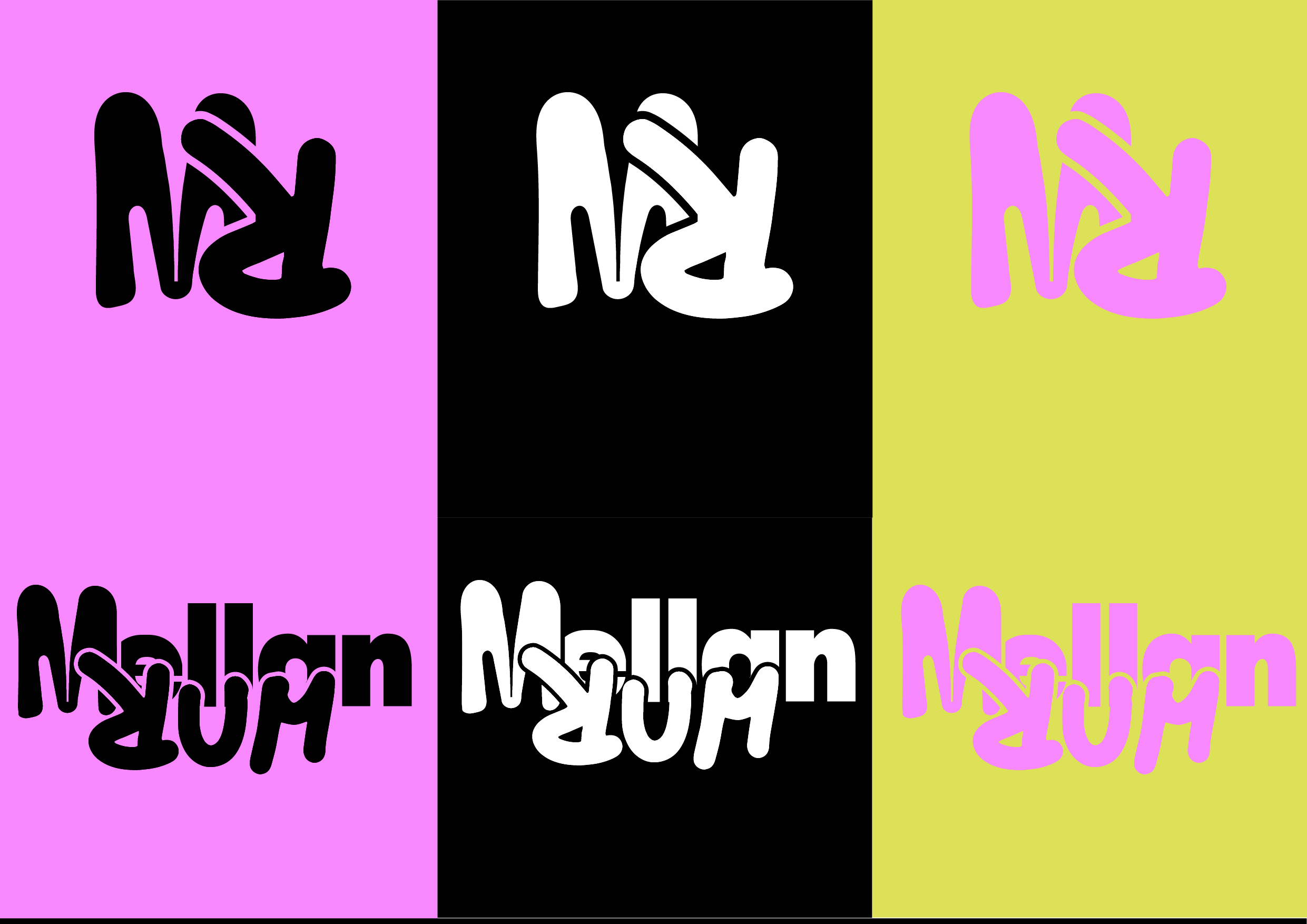
Mellanrum is a festival based on the theme of “movement,” which can be interpreted physically, mentally, and socially. The name “Mellanrum” refers to the space in between — a pause, a breath, and a moment for reflection in a fast-paced and digital everyday life. The purpose of the festival is to bring people closer together in the physical world and encourage them to disconnect from social media. In today’s society, genuine encounters are becoming less common; therefore, Mellanrum creates a space where people can meet, move, and interact in the present moment. The logo of Mellanrum is designed to reflect movement and flow. The soft, irregular letterforms and playful structure symbolize change and transition — between stillness and movement. Through this project, I wanted to create a visual identity that captures the importance of human connection and moments of presence in today’s fast-paced digital society. My aim was to create a festival concept that invites people to pause, reflect, and engage with each other in the physical space. The design explores the balance between movement and stillness, creating a visual language that feels dynamic, welcoming, and emotionally connected.
Comments (0)
Log in to leave a comment.